This originally appeared on the Joel on Software discussion group. This issue was the value of simplicity in product design, and whether it requires removing features.
There is a difference between features of the product and features exposed in the user interface. Take automobile traction control as an example. If you don’t know, it uses sensors in each wheel to detect a slipping wheel and either apply the brakes or limit power to that wheel until it stops slipping. Many cars have this feature now, but most don’t have any user interface to it.
Some cars, though, have a button you can press when you’re driving in icy conditions. This changes the response of the system to be more aggressive about stopping wheelspin.
Then there’s the Corvette. The first version to have traction control had the option to completely disable it. Under racetrack conditions, sometimes the fastest line requires intentionally sliding the rear end to set up for the next turn. Traction control can’t anticipate that.
In the real world, how many people are actually good enough drivers that they can take advantage of that exceptional condition? How often are they really able to take advantage of it? How many ever have?
Now how many people want to believe that someday they’ll drive like that? The feature makes the car better. Needlessly exposing the feature in the user interface makes the car more marketable. People like to believe they’re not average, but instead the elite for whom “good enough” just isn’t.
A related phenomenon leads to Jeep commercials touting the off-road prowess of vehicles that, for the most part, never leave the suburbs. People want to believe that they someday will do something exceptional, and want their product to support that belief.
Nissan, back when they were called Datsun, once had a commercial that came right out and said it: “You won’t go 0-50 in 6 seconds flat but you know you could. You won’t use it’s drag speed of over 100 mp/h but you know you could. And when the light turns green you won’t flaunt your turbo power but knowing you could is awesome!”
https://www.youtube.com/watch?v=CgAxVtZbPZo
Now apply this to the washing machine that senses what kind of load it has. Personally, I can’t think of many things I care less about than my skill in classifying loads of laundry. But I would still have trouble accepting a salesman’s pitch that really, the machine is smarter than me about this. If Consumer Reports backed it up, though, I’d take a one-button washer and a one-button dryer.
===
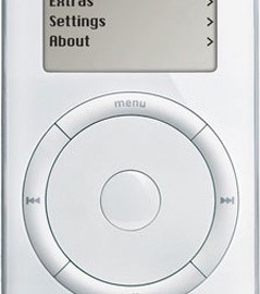
Now consider the first iPod. It didn’t play several poplar audio file formats. Lack of this capability is not “simplicity”. If the codecs were added, the user interface wouldn’t have to change. More features, same simplicity.
===
Then there are cars with remote keyless entry that doesn’t depend on pressing a button. Simply approach the car with the fob in your pocket and the doors unlock. Very simple. But there are times you need to decide whether the car is locked or not
- If you have your spare keys in your gym bag in the trunk when you walk away, the car doesn’t lock. Oops.
- You can’t leave the car unlocked while you and the kids make several trips to unload groceries. You’d have to hand off the remote every time one of you goes down.
I think the process probably could be simplified, but I would want extensive usability testing and design work before I would take a car that decided for me when to be locked and when to be unlocked.
===
Finally, consider two different cars.
Vehicle #1:
- Three-speed stick shift
- Two-wheel drive
- Solid rear axle
Vehicle #2:
- Seven-speed automatic
- Adaptive all-wheel drive
- Positraction
- Traction control
Which one is simpler? Hmm, that depends. Do you mean simpler in design, or simpler for the user?
Let’s make it closer, and say Vehicle #1 is now an automatic. Now they’re equally simple for the user. But Vehicle #2 does more, making the decisions for the user.
In “Choices = Headaches” Joel said the user interface should be simple. Not that the features shouldn’t be there, just that the user shouldn’t have to chose when to use which.
